2. Analysis of CTD data
Dan Kelley (https://orcid.org/0000-0001-7808-5911) and Clark Richards (https://orcid.org/0000-0002-7833-206X)
2026-04-19
Source:vignettes/B_ctd.Rmd
B_ctd.RmdAbstract. The basics of working with CTD data are outlined in this vignette, as a supplement to a shorter entry in the main vignette.
Pre-trimmed data
Many of the object types supported by oce come with
built-in data. For an example, data(ctd) yields a CTD
profile that has been trimmed to just the downcast portion of the
sampling. (See the next section to learn how to do this trimming.) A
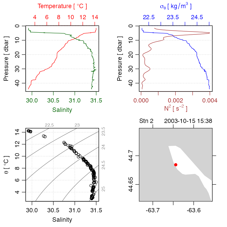
summary and plot (Figure 2) are created as follows.
library(oce)
data(ctd)
summary(ctd)
#> CTD Summary
#> -----------
#>
#> * File:                "/Users/kelley/git/oce/create_data/ctd/ctd.cnv"
#> * Instrument:          SBE 25
#> * Temp. serial no.:    1140
#> * Cond. serial no.:    832
#> * Original file:       c:\seasoft3\basin\bed0302.hex
#> * Start time:          2003-10-15 15:38:38
#> * Sample interval:     1 s
#> * Cruise:              Halifax Harbour
#> * Vessel:              Divcom3
#> * Station:             Stn 2
#> * Mean Location:       44.684N 63.644W
#> * Data Overview
#>
#>                               Min.   Mean   Max.   Dim. NAs OriginalName
#>     scan                      130    220    310    181  0   "scan"
#>     timeS [s]                 129    219    309    181  0   "timeS"
#>     pressure [dbar]           1.48   22.885 44.141 181  0   "pr"
#>     depth [m]                 1.468  22.698 43.778 181  0   "depS"
#>     temperature [°C, IPTS-68] 2.919  7.5063 14.237 181  0   "t068"
#>     salinity [PSS-78]         29.916 31.219 31.498 181  0   "sal00"
#>     flag                      0      0      0      181  0   "flag"
#>
#> * Processing Log
#>
#>     - 2018-11-14 20:03:47 UTC: `create 'ctd' object`
#>     - 2018-11-14 20:03:47 UTC: `read.ctd.sbe(file = file, debug = 10, processingLog = processingLog)`
#>     - 2018-11-14 20:03:47 UTC: `oce.edit(x = ctd, item = "startTime", value = as.POSIXct(gsub("1903",     "2003", format(ctd[["startTime"]])), tz = "UTC") + 4 * 3600,     reason = "file had year=1903, instead of 2003", person = "Dan Kelley")`
plot(ctd)
Figure 2. An overview of a ctd dataset.
Accessing the data within this ctd object can be done
directly, e.g. ctd@data$pressure holds the pressure record,
but it is usually better to use an accessor function that is provided
with oce. This function is named [[, and it
takes a character string as an argument,
e.g. ctd[["pressure"]] yields the pressure column. The
accessor notation is preferable to direct access because it is simpler
for the user. For example, several oce objects store the
data in single-byte or two-byte chunks, to match the raw format used by
the instruments, and the accessor function takes care of translating
these values to what are sometimes called “science” units.
Exercise 1. Plot a profile of
and
within the pycnocline in the built-in ctd data set. (Hint:
use subset().)
Raw data
Practicing Oceanographers may be wondering how the CTD cast used in the preceding section was trimmed of equilibration-phase and upcast-phase data. Spurious data from these phases must be trimmed as a first step in processing. For example, consider the following code.

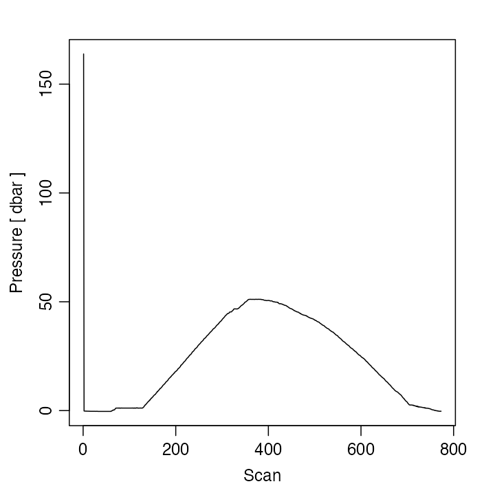
Figure 3. Scanwise plot of the ctdRaw
sample data set. Note the spike at the start, the equilibration phase
before the downcast, and the spurious freshening signal near the start
of the upcast.
This produces a two-panel plot (Figure 3) of the data as a time-series, revealing not just the desired downcast, but also an earlier equilibration phase and a later upcast. The x-axis in Figure 3 is the scan number, which is a convenient index for extraction of the downcast portion of the profile by an essentially manual method, e.g. proceeding with a sequence of commands such as
plotScan(ctdTrim(ctdRaw, "range",
    parameters = list(item = "scan", from = 140, to = 250)
))
plotScan(ctdTrim(ctdRaw, "range",
    parameters = list(item = "scan", from = 150, to = 250)
))
This method of making decisions based on plotted information is probably the most robust method of trimming data. However, for quick work, users may be satisfied with the results of automatic downcast detection, e.g.
ctdTrimmed <- ctdTrim(ctdRaw)It should be noted that ctdTrim() inserts entries into
the object’s log file, so that the details of how the trimming was done
are recorded together with the data.
Once the profile has been trimmed, one may wish to use
ctd.decimate() to smooth the data and interpolate the
smoothed results to uniformly-spaced pressure values.
Taking these things together, a quick visual examination of a CTD file takes just one line of code:
plot(ctdDecimate(ctdTrim(read.ctd("stn123.cnv"))))Argo-derived Data
The Argo program provides data that have very expansive coverage,
(see, for example, Figures 1 and 2 of Kelley et al. 2021) and so the
oce package provides several ways to work with them.
Sometimes it makes sense to work directly with argo-class
data (which has generic functions for summaries, plotting, data
extraction, subsets, etc.), and other times it makes sense to convert to
ctd-class first. Entries to the two approaches are outlined
in the documentation for read.argo() and
argo2ctd(), respectively; in both cases, there are links to
related functions that are worth exploring.
WOCE archive data
The package has a harder time scanning the headers of data files in
the WOCE archive format than it does in the Seabird format illustrated
earlier. This is mainly because front-line researchers tend to work in
the Seabird format, and partly because the WOCE format is odd. For
example, the first line of a WOCE file is of the form
CTD,20060609WHPOSIODAM (or BOTTLE,...).
Scanning the item to the left of the comma is not difficult (although
there are variants to the two shown, e.g. CTDO sometimes
occurs). The part to the right of the comma is more difficult. The first
part is a date (yyyymmdd) so that is no problem. But then
things start to get tricky. In the example provided, this text contains
the division of the institute (WHPO), the institute itself (SIO), and
initial of the investigator (DAM). The problem is that no dividers
separate these items, and that there seem to be no standards for the
item lengths. Rather than spend a great deal of time coding special
cases (e.g. scanning to see if the string SIO occurs in the
header line), the approach taken with oce is to ignore such
issues relating to quirky headers, on the assumption that users can scan
human-written headers with high skill.
Quite commonly, CTD profiles taken during a cruise are collected together in a sequence of files in a given directory. For a real-world example, one might visit the website mentioned in the code provided below, download and expand the zip file, enter the directory thus formed, and run the code to get an overall TS plot for all the CTD stations of this cruise. (Caution: the link seems to change from time to time.)
library(oce)
# http://cchdo.ucsd.edu/data/7971/ar18_58JH19941029_ct1.zip
# setwd("~/Downloads/ar18_58JH19941029_ct1")
files <- list.files(pattern = "*.csv$", full.names = TRUE)
for (i in seq_along(files)) {
    x <- read.ctd(files[i])
    if (i == 1) {
        plotTS(x, Slim = c(31, 35.5), Tlim = c(-2, 10), type = "o")
    } else {
        points(x[["salinity"]], x[["potential temperature"]])
        lines(x[["salinity"]], x[["potential temperature"]])
    }
}
The [[ notation is explained in Section 3, but this
example conveys the gist, that it permits accessing data, or derived
data, from within an object.
In the above, lines connect the points within a given profile. This can be a useful method for a quick scan looking for outliers. Another is to colour-code the profiles, although this gets confusing with large datasets, in which case the method of the following exercise might be useful.
Exercise 2. (advanced) Make a multi-file plot summarizing the TS relationship in a collection of CTD datasets, with each plot file showing the overall relationship in gray and the individual profile in black.
Solutions to exercises
Exercise 1. Plot a profile of
and
within the pycnocline in the built-in ctd data set. (Hint:
use subset().)
Although one may argue as to the limits of the pycnocline, for illustration let us say it is in 5 dbar to 12 dbar range. One way to do this is
library(oce)
data(ctd)
pycnocline <- ctdTrim(ctd, "range",
    parameters = list(item = "pressure", from = 5, to = 12)
)
plotProfile(pycnocline, which = "density+N2")
Another is
library(oce)
data(ctd)
pycnocline <- subset(ctd, 5 <= pressure & pressure <= 12)
plotProfile(pycnocline, which = "density+N2")
Exercise 2. (advanced) Make a multi-file plot summarizing the TS relationship in a collection of CTD datasets, with each plot file showing the overall relationship in gray and the individual profile in black.
The code provided below creates 91 PNG files, with names
ar18_01.png, ar18_02.png, etc. Loading these
in a view that permits quick paging through this file list is an easy
way to spot suspicious data, since each plot has the station number at
the top. (Users trying this example should bear in mind that this is a
fairly large dataset, so the processing will take up to a minute.)
library(oce)
# http://cchdo.ucsd.edu/data/7971/ar18_58JH19941029_ct1.zip
# setwd("~/Downloads/ar18_58JH19941029_ct1")
files <- list.files(pattern = "*.csv$", full.names = TRUE)
n <- length(files)
ctds <- vector("list", n) # to hold the CTD objects
station <- vector("list", n)
for (i in 1:n) {
    ctds[[i]] <- read.ctd(files[i])
    station[[i]] <- ctds[[i]][["station"]]
}
sal <- unlist(lapply(1:n, function(i) ctds[[i]][["salinity"]]))
tem <- unlist(lapply(1:n, function(i) ctds[[i]][["temperature"]]))
pre <- unlist(lapply(1:n, function(i) ctds[[i]][["pressure"]]))
overall <- as.ctd(sal, tem, pre)
png("ar18_%02d.png")
for (i in 1:n) {
    plotTS(overall, col = "gray")
    lines(ctds[[i]][["salinity"]], ctds[[i]][["potential temperature"]])
    mtext(station[i], side = 3, line = 0)
}
dev.off()
References
- Kelley, Dan E., Jaimie Harbin, and Clark Richards. “argoFloats: An R Package for Analyzing Argo Data.” Frontiers in Marine Science 8 (May 2021). https://doi.org/10.3389/fmars.2021.635922.)