Wind and waves during a Nor'Easter storm
Preface
This blog item, created 2023-11-05, is a reworked version of an original item from 2016-02-09. The data format from the agency had changed quite a lot over the years, and so the graphs are somewhat different. Most of the variable names are changed, and there are also numerical changes that presumably reflect improvements in calibrations or procedures. The wave period is very noticably changed, though, and it would make sense to investigate this more. There are also some small but odd changes, e.g. the new data are reported at 20 minutes after the hour, as opposed to 0 minutes for the old data. Also, wind direction used to be quantized, but now it is not (or at least the field I am using is not). For reference, the old blog posting has a link to the old data, as downloaded in 2016.
Given the above, readers are cautioned strongly against taking the code below to be ideal. It would make sense to consult the documentation on the file format before any serious analysis.
Introduction
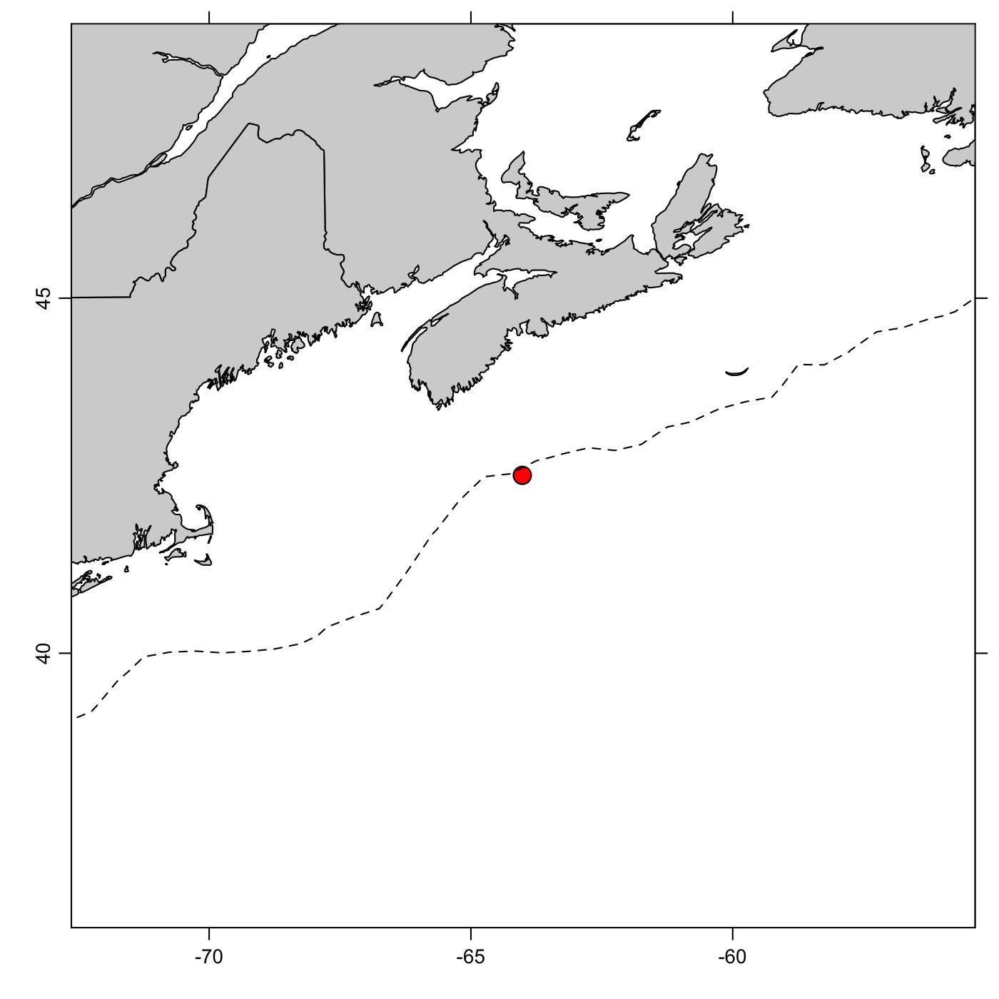
Several buoys measure wave conditions off the coast of Nova Scotia. I was hoping to get data from the nearest one (ID 44258) but it did not have many non-missing data, so I instead chose one further offshore (ID 44150; see (http://www.ndbc.noaa.gov/station_page.php?station=44150)[http://www.ndbc.noaa.gov/station_page.php?station=44150]). This is owned and maintained by Environment Canada, and is located roughly south of Halifax and east of Cape Cod, near the 1000m isobath, as indicated on the map below.
Analysis
Study region
library(oce)
lon <- -64.018
lat <- 42.505
data(coastlineWorldFine, package = "ocedata")
par(mfrow = c(1, 1))
plot(coastlineWorldFine, clongitude = -64.0, clatitude = 42.5, span = 2000)
points(lon, lat, bg = "red", cex = 2, pch = 21)
data(topoWorld) # coarse resolution
contour(topoWorld[["longitude"]], topoWorld[["latitude"]], topoWorld[["z"]],
    levels = -1000, lty = 2, drawlabels = FALSE, add = TRUE
)
Download and read data
# Cache file to avoid download delay (or failure)
url <- "https://www.meds-sdmm.dfo-mpo.gc.ca/alphapro/wave/waveshare/csvData/c44150_csv.zip"
zipfile <- gsub(".*/", "", url)
file <- gsub("_", ".", gsub(".zip", "", zipfile))
if (!file.exists(file)) {
    download.file(url, zipfile)
    unzip(zipfile)
}
dall <- read.csv(file, header = TRUE)
time <- as.POSIXct(dall$DATE, "%m/%d/%Y %H:%M", tz = "UTC")
start <- as.POSIXct("2015-12-26 00:00", tz = "UTC")
end <- as.POSIXct("2016-02-09 15:00:00", tz = "UTC")
# trim data before Boxing Day, 2015 and after Feb 9, 2016
keep <- start <= time & time <= end
d <- subset(dall, keep)
time <- subset(time, keep)

# Note that the column names have been changed by the data provider,
# since the year 2016 when I first blogged about this.
# variable names are described at
# https://www.meds-sdmm.dfo-mpo.gc.ca/isdm-gdsi/waves-vagues/formats-eng.html#Par
waveHeight <- d[["VWH."]] # "characteristic significant wave height" was WVHT
dominantWavePeriod <- d[["VTPK"]] # "wave spectrum peak period (MEDS)" was DPD
windDirection <- d[["WDIR.1"]] # was WDIR
windSpeed <- d[["WSPD.1"]] # was WSPD
airPressure <- d[["ATMS"]] # was PRES
theta <- 90 - windDirection # convert from CW-from-North to CCW-from-East
# multiply by -1 to convert from "wind from" to "wind to"
windU <- -windSpeed * cos(theta * pi / 180)
windV <- -windSpeed * sin(theta * pi / 180)
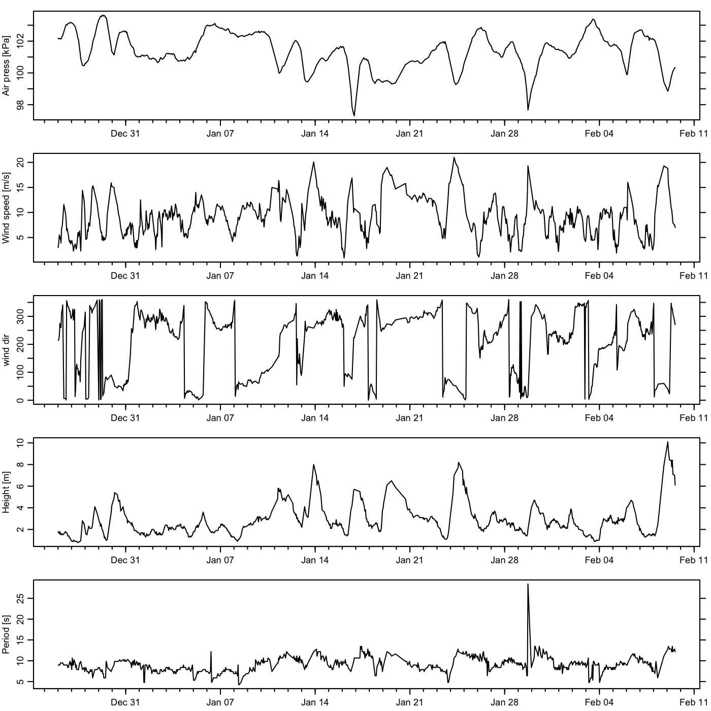
Plot time series
par(mfrow = c(5, 1))
oce.plot.ts(time, airPressure / 10, ylab = "Air press [kPa]", drawTimeRange = FALSE, mar = c(2, 3, 1, 1))
oce.plot.ts(time, windSpeed, ylab = "Wind speed [m/s]", drawTimeRange = FALSE, mar = c(2, 3, 1, 1))
oce.plot.ts(time, windDirection, ylab = "wind dir", drawTimeRange = FALSE, mar = c(2, 3, 1, 1))
oce.plot.ts(time, waveHeight, ylab = "Height [m]", drawTimeRange = FALSE, mar = c(2, 3, 1, 1))
oce.plot.ts(time, dominantWavePeriod, ylab = "Period [s]", drawTimeRange = FALSE, mar = c(2, 3, 1, 1))
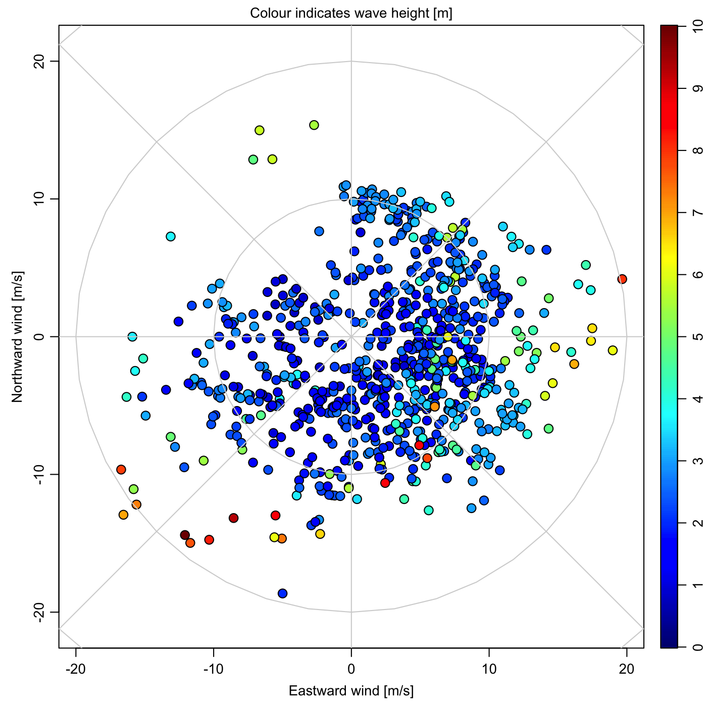
Wind-rose diagram, coloured by wave height
par(mfrow = c(1, 1))
cm <- colormap(waveHeight, zlim = c(0, 10), col=oceColorsJet)
par(mar = c(3.5, 3.5, 1.5, 1), mgp = c(2, 0.7, 0))
drawPalette(zlim = cm$zlim, col = cm$col)
plot(windU, windV,
    asp = 1, cex = 1.4, pch = 21, bg = cm$zcol,
    xlim = c(-1, 1) * max(abs(c(windU, windV))),
    ylim = c(-1, 1) * max(abs(c(windU, windV))),
    xlab = "Eastward wind [m/s]", ylab = "Northward wind [m/s]"
)
mtext("Colour indicates wave height [m]", side = 3, line = 0.25)
for (ring in seq(10, 30, 10)) {
    circleX <- ring * cos(seq(0, 2 * pi, pi / 20))
    circleY <- ring * sin(seq(0, 2 * pi, pi / 20))
    lines(circleX, circleY, col = "lightgray")
}
abline(h = 0, col = "lightgray")
abline(v = 0, col = "lightgray")
abline(0, 1, col = "lightgray")
abline(0, -1, col = "lightgray")
Discussion
Although waves are not entirely related to local winds, it may be worth comparing them. The time-series plots indicate a correspondence of high wind and large waves. However, the wind-rose plot indicates that this is mainly true for certain wind directions. The strong winds from February 8 that caused the largest waves are indicated with the dark-red dot in the lower-left quadrant. This quadrant corresponds to winds that locals call NorEasterly, and those locals who take to the sea will not be surprised by the wave heights indicated on the storm, or by their long period as indicated in the time-series plot.