Spline and other data smoothing
Smoothing data is a common component of the analysis of oceanographic data. If we can think of errors (or uncertainties – you pick the word you like) as occurring just in the “y” variable, then two approaches come to mind: (1) fit a smoothing spline and (2) interpolate the data to a uniform grid and then apply a smoothing digital filter. The first of these is familiar to many R users, but the second is more common in the wider community.
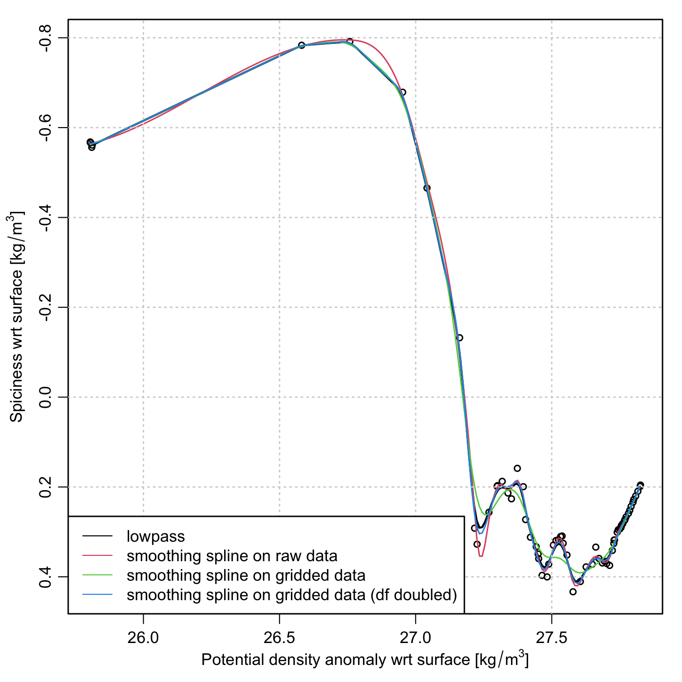
Let me illustrate with a graph I was making today, as shown below. This shows the co-dependence of two seawater properties: density (on the x axis) and something called “spiciness” (on the y axis). My interest is in smoothing the curve, and finding spots on it that have zero slope, i.e. densities at which spiciness is a local maximum or minimum.
I will let the graph and the code speak for themselves. The code downloads a
sample file, and I encourage readers to run the code (after removing the
png() call for interactive work), altering things slightly to see the effect
on the curves. For the splines, try altering the df definition and, in the
second smooth.spline() call, alter the altered value for that parameter.
Start with small changes, so you can gain intuition on such things as (a)
whether increasing df increases or decreases the smoothness of the resultant
lines on the diagram and (b) how sensitive this smoothing change is to
variations of df. And, for the lowpass case, alter deltaSigma and n
individually and then together, to see how results change. In half an hour, you
will likely have enough intuition to try this sort of thing for yourself.
Because there are no agreed-upon methods for selecting and adjusting smoothing methods, I advise doing tests like this on data of your own, to find values that suit your goals, and to see if these are related methods will be of use to you.
Graph under discussion
Code
The first time you run this code, it will download an Argo file. After that, it will use that file without downloading it again. If run non-interactively, this code produces a PNG file.
library(oce)
# Download a test (Argo) file and cache it locally.
url <- "https://github.com/dankelley/dek_blog/raw/main/docs/assets/data/D4901076_061.nc"
file <- gsub(".*/", "", url)
if (!file.exists(file)) {
    download.file(url, file)
}
# If run non-interactively, create a PNG file
if (!interactive()) {
    png("2024-02-16-spline.png", height = 7, width = 7, unit = "in", res = 200)
}
par(mfrow = c(1, 1), mar = c(3.5, 3.5, 1, 1), mgp = c(2, 0.7, 0), lwd = 1.4)
# Read the file, extract some data, and start plotting
a <- read.oce(file)
sig0 <- a[["sigma0"]]
pi0 <- a[["spiciness0"]]
plot(sig0, pi0,
    xlab = resizableLabel("sigma0"),
    ylab = resizableLabel("spiciness0"),
    ylim = rev(range(pi0)),
    cex = 0.8
)
# Smooth in 4 different ways
deltaSigma <- 0.01
n <- 9 # must be an odd number
df <- length(sig0) / 3
sig0out <- seq(min(sig0), max(sig0), deltaSigma)
a <- approx(sig0, pi0, sig0out)
lines(a$x, lowpass(a$y, n = n), col = 1, lwd = 2)
s1 <- smooth.spline(pi0 ~ sig0, df = df)
ps1 <- predict(s1, sig0out)
lines(ps1$x, ps1$y, col = 2)
s2 <- smooth.spline(a$y ~ a$x, df = df)
ps2 <- predict(s2, sig0out)
lines(ps2$x, ps2$y, col = 3)
s3 <- smooth.spline(a$y ~ a$x, df = df * 2)
ps3 <- predict(s3, sig0out)
lines(ps3$x, ps3$y, col = 4)

grid()
legend("bottomleft",
    lwd = 1, col = 1:4, bg = "white",
    legend = c(
        "lowpass",
        "smoothing spline on raw data",
        "smoothing spline on gridded data",
        "smoothing spline on gridded data (df doubled)"
    )
)