Faded colourscheme in R
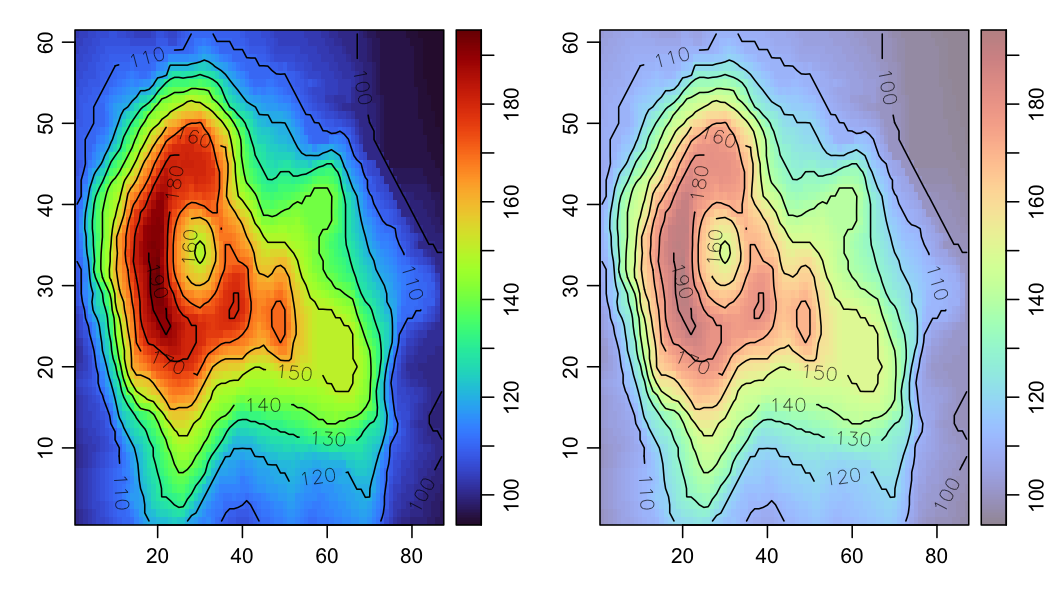
Sometimes I want to put contours on top of an image, because then I have the best of two worlds: colours to give me a feel for the highs and lows of a field, and contours to give me quantitative values.
However, it can be difficult to see contour lines and labels against dark
colours. One solution is to use a faded palette (think of mixing white paint
into coloured paint), and the function illustrated in the code below does just
that. In the example, I am using the oceColorsTurbo palette, not because I
think that is appropriate for the example plot, but rather because it is a
scheme I often use for other things, and it suffers the problem of hiding
contours.
# How to fade a colour palette
library(oce)
faded <- function(alpha = 0.1, col = oce::oceColorsTurbo) {
    stopifnot(alpha <= 1 && alpha >= 0)
    function(n) paste0(col(n), as.raw(as.integer(255 * alpha)))
}
par(mfrow = c(1, 2))
# normal
x <- seq_len(dim(volcano)[1])
y <- seq_len(dim(volcano)[2])
imagep(volcano, col = oceColorsTurbo)
contour(x, y, volcano, add = TRUE, labcex = 1)
# faded
imagep(volcano, col = faded(0.5))
contour(x, y, volcano, add = TRUE, labcex = 1)