Handling data flags with the oce package
The section dataset from oce provides a good example of a dataset
containing flags. I’ll show how to handle such flags here, step by step.
library(oce)
data(section)
Sflag <- section[["salinityFlag"]]
A good first step is to see what flags are being used. The table()
function call
table(Sflag)
yields
## Sflag
##    2    3    4
## 2298  440  103
What do the numbers mean? Well, this particular dataset uses the World
Hydrographic Program (WHP) convention for flags (see ?section), in which a
flag value of 2 is used to indicate data considered to be acceptable. Thus, the
table indicates that only 3/4 of the salinity measurements are considered to be
acceptable. This makes this a good dataset to illustrate the handling of flags.
First, extract some relevant data.
S <- section[["salinity"]]
T <- section[["temperature"]]
theta <- section[["theta"]]
p <- section[["pressure"]]
Sflag <- section[["salinityFlag"]]
lon <- section[["longitude"]]
lat <- section[["latitude"]]
Next, plot salinity flag vs salinity
plot(S, Sflag, pch = Sflag - 1)
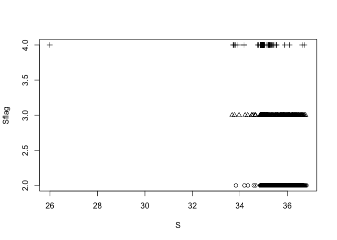
This suggests that, apart from one distinct outlier at a salinity of 26, the salinities of bad data are generally in the range of the salinities of good data. Next, examine temperature and salinity together.
plotTS(as.ctd(S, T, p, longitude = lon, latitude = lat), pch = Sflag - 1)
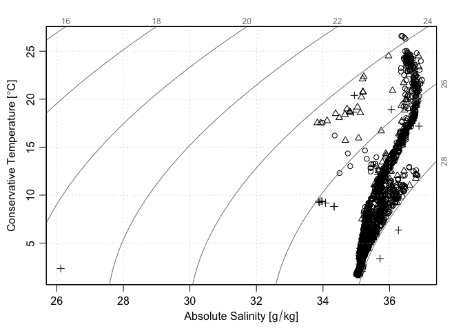
The last two plots suggest that one of the points marked as being bad (flag=4) is distinctly anomalous compared with all the other data. A detailed analysis could be made of that point (e.g. first isolate the station, then plot it in detail) but time may be better spent simply focussing on data that have been assessed as being reasonable during the data-archiving process.
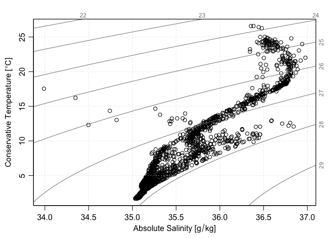
ok <- Sflag == 2
plotTS(as.ctd(S[ok], T[ok], p[ok], longitude = lon[ok], latitude = lat[ok]))

Another approach is to use handleFlags() to select the good data
section2 <- handleFlags(section)
plotTS(section2)
Here, we have used the fact that plotTS can recognize section objects. The
use of handleFlags() is also recommended because it carries over to other
types of plots, e.g. a salinity section. For example, a salinity section of all
the data is produced as follows. The top row shows the original section, and
the bottom one shows the result after using handleFlags(). Note that the top
row has quite a few isolated points that do not fit the pattern, as revealed by
small closed contours on those plots and blue blobs on the images. Also note
that the overall pattern is changed in these plots, because the bad data are
controlling the contour/image scale ranges.
par(mfrow = c(2, 2))
plot(section, which = "salinity")
plot(section, which = "salinity", ztype = "image", zcol = oceColorsJet)
plot(section2, which = "salinity")
plot(section2, which = "salinity", ztype = "image", zcol = oceColorsJet)

Exercises
- Find which station has the very low salinity, and examine that station in more detail.
- Try as above, but only discarding data with
salinityFlag==4, which are known to be bad (i.e. retain both acceptable and questionable data). - Continue step 2, with other types of analysis (e.g. examine spatial dependence).
- Look online for the source of the
sectiondataset, to find out more about how the data-quality flags were assigned.