Graphing Email Logs
Communication between individuals working on a group project is commonly carried over email, and in-person meetings tend to be preceded by an emailed agenda, and followed by emailed minutes. Projects organized around GitHub or similar systems tend also to have email updates for issue reports, etc. All of this means that a graph of email timing can be helpful in indicating activity. Such graphs are easier to interpret than a printed list of dates, and I have found them to be quite helpful in organizing group work.
I make the graphs in R, and the point of this exercise is to illustrate how to do that. Below is an example, in which I’ve substituted colour names for person names. In this case, I have put the data into the format (time, sender, recipient); obviously, it is also simple to put instead a subject line, lines of text, etc; it all depends on the purpose.
library(oce)
# Next two lines establish adjustable parameters
parameters <- list(
    space = 0.1, # controls width for strings
    size = 0.8, # controls size of text labels
    col = 4 # controls colour of lines and text
)
# Data: time,sender,recipient
data <- "
2015-08-24 16:14:17,blue,blue
2015-08-19 09:18:00,blue,red
2015-07-31 14:23:31,red,blue
2015-07-31 13:48:56,beige,blue
2015-07-31 12:17:00,brown,beige
2015-07-31 11:15:00,purple,beige
2015-07-30 19:59:00,green,yellow
2015-07-30 08:09:00,orange,blue
2015-07-30 08:09:00,blue,orange
2015-07-30 07:59:00,orange,green
2015-07-30 07:56:00,orange,blue
2015-07-30 07:59:00,green,yellow
2015-07-29 21:04:00,yellow,green
2015-07-29 11:07:00,green,yellow
2015-07-28 15:22:00,yellow,green
2015-04-11 10:19:00,blue,pink
2015-04-11 10:13:00,blue,red
2015-04-11 09:43:00,red,blue
2015-04-01 08:40:00,red,blue
"
d <- read.csv(text = data, header = FALSE)
t <- as.POSIXct(d$V1, tz = "UTC")
o <- order(t, decreasing = TRUE) # just in case
t <- t[o]
from <- d$V2[o]
to <- d$V3[o]
n <- length(from)
day <- 86400
par(mar = c(2, 2, 1, 1), mgp = c(2, 0.7, 0))
timeSpan <- as.numeric(max(t)) - as.numeric(min(t))
space <- parameters$space * parameters$size * timeSpan
plot(t, 1:n,
    type = "n", axes = FALSE,
    xlab = "", ylab = "", xlim = c(min(t), max(t) + 4 * space),
    ylim = c(0, n + 1)
)
oce.axis.POSIXct(1, drawTimeRange = FALSE)
box()
tl <- max(t) + space
cex <- parameters$size * par("cex")
col <- parameters$col
for (i in 1:n) {
    text(tl + 0.3 * space, i, paste(from[i], "-", to[i], sep = ""),
        pos = 4, cex = cex, col = col
    )
    lines(c(tl, t[i]), rep(i, 2), col = col)
    lines(c(t[i], t[i]), c(i, 0), col = col)
}
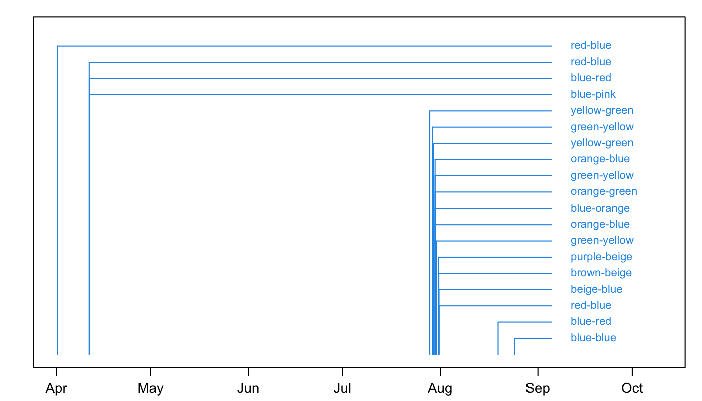
This shows that there was a fair bit of activity in the Spring, and then much more intense work near the end of July. The labels show sender and recipient; in some cases it would make sense to put in keywords or subjectlines. It all depends on the purpose, of course.
The code has some hard-wired constants for spacing, and this will likely need adjustment for other time spans also for other string sizes. No pretence at elegance is being made in the code; the idea is just to present a rough framework that readers can modify to suite their needs. For example, some readers will prefer the list to have most recent items at the top, and that can be arranged by plotting the labels below the time axis.
Readers will almost certainly want to display other things in the text lines; the method should be completely obvious to anyone with introductory R skills.