Hodograph Drawing
Introduction
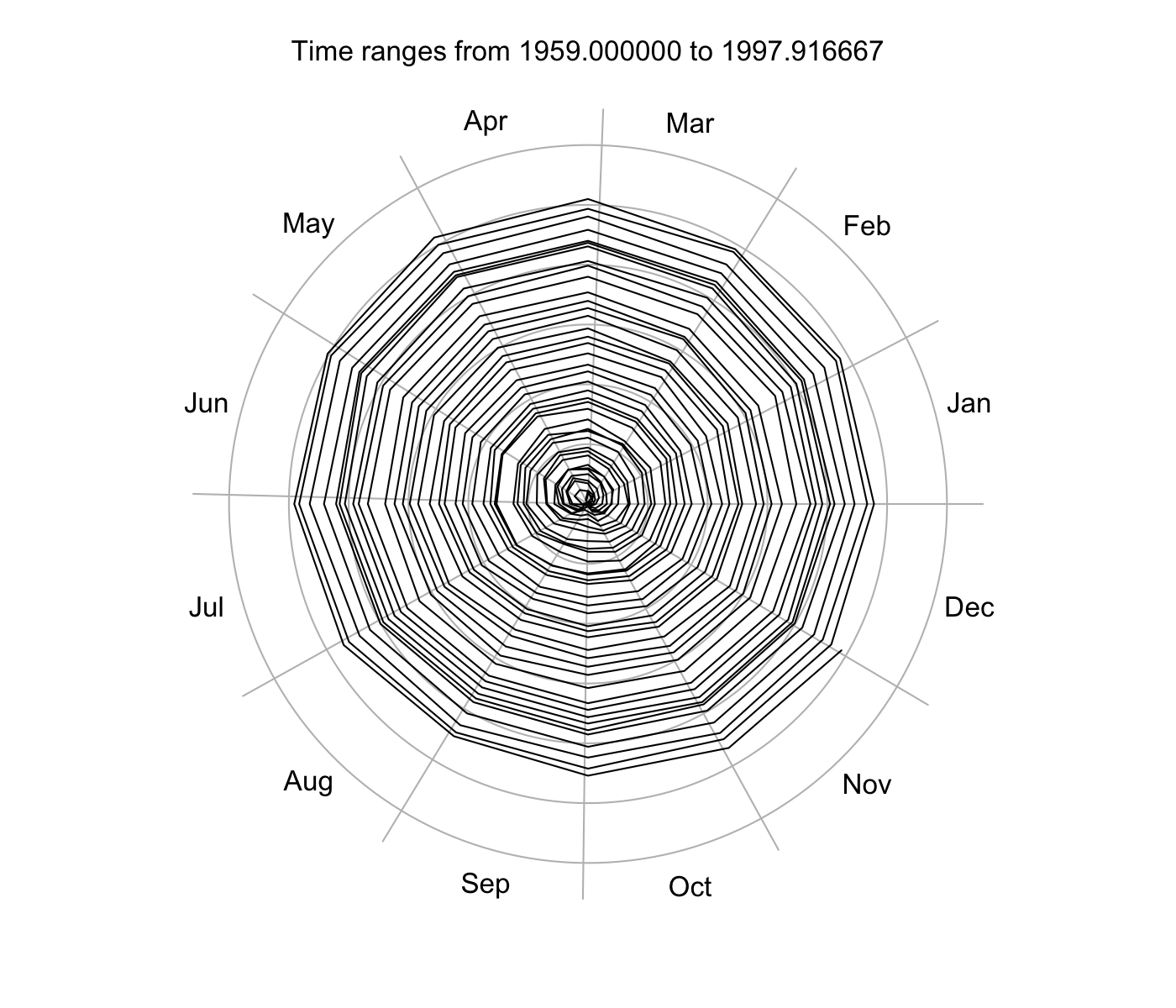
The polar graph known as a hodograph can be useful for vector plots, and for showing variation within nearly cyclical time series data. The Oce R package should have a function to create hodographs, but as usual my first step is to start by writing isolated code, testing to find the right match between the function and real-world needs.
The code chunk given below is such a test, with the build-in dataset named
co2, which is a time-series starting in 1959. The hodograph is for the
variation of CO2 from its value in 1959, so the data start at zero radius.
Climatologists will see why this makes sense, and climate-change deniers will
think it’s part of a hoax.
Please note that the argument list and the aesthetics of the plot will likely need adjustment for other applications.
Methods
First, define hodograph(), with arguments that suffice for a simple problem
of a periodic signal x=x(t) to be plotted in polar fashion with radius
indicating x and angle indicating t modulo 1 year.
The code and a test are as follows.
png("2014-02-08-hodograph_%d.png", unit = "in", width = 7, height = 6, res = 200)
hodograph <- function(x, y, t, rings, ringlabels = TRUE, tcut = c("daily", "yearly"), ...) {
tcut <- match.arg(tcut)
if (missing(t)) {
stop("x-y method not coded yet\n")
} else {
if (!missing(y)) {
stop("cannot give y if t is given\n")
}
if (tcut == "yearly") {
t <- as.POSIXlt(t)
start <- ISOdatetime(1900 + as.POSIXlt(t[1])$year, 1, 1, 0, 0, 0,
tz = attr(t, "tzone")
)
day <- as.numeric(julian(t, origin = start))
xx <- x * cos(day / 365 * 2 * pi)
yy <- x * sin(day / 365 * 2 * pi)
# axes
if (missing(rings)) {
rings <- pretty(sqrt(xx^2 + yy^2))
}
rscale <- max(rings)
theta <- seq(0, 2 * pi, length.out = 200)
plot(xx, yy,
asp = 1, xlim = rscale * c(-1.04, 1.04), ylim = rscale * c(-1.04, 1.04),
type = "n", xlab = "", ylab = "", axes = FALSE
)
# month lines
month <- c("Jan", "Feb", "Mar", "Apr", "May", "Jun", "Jul", "Aug", "Sep", "Oct", "Nov", "Dec")
day <- c(31, 28, 31, 30, 31, 30, 31, 31, 30, 31, 30, 31)
rscale <- max(rings)
for (m in 1:12) {
# boundaries are for non leap years
phi <- 2 * pi * (sum(day[1:m]) - day[1]) / sum(day)
lines(rscale * 1.1 * cos(phi) * c(0, 1), rscale * 1.1 * sin(phi) * c(0, 1), col = "gray")
phi <- 2 * pi * (0.5 / 12 + (m - 1) / 12)
text(1.1 * rscale * cos(phi), 1.1 * rscale * sin(phi), month[m])
}
for (r in rings) {
if (r > 0) {
gx <- r * cos(theta)
gy <- r * sin(theta)
lines(gx, gy, col = "gray")
if (ringlabels) {
text(gx[1], 0, format(r))
}
}
}
points(xx, yy, ...)
} else {
stop("only tcut=\"yearly\" works at this time\n")
}
}
}
data(co2)
t0 <- as.POSIXlt("1959-01-01 00:00:00", tz = "UTC")
year <- as.numeric(time(co2))
t <- t0 + (year - year[1]) * 365 * 86400
data <- data.frame(t = t, co2 = as.numeric(co2))
par(mar = rep(3, 4))
with(
data,
hodograph(x = co2 - co2[1], t = t, tcut = "yearly", type = "l", ringlabels = FALSE)
)
mtext(sprintf("Time ranges from %f to %f", year[1], tail(year, 1)), line = 1)
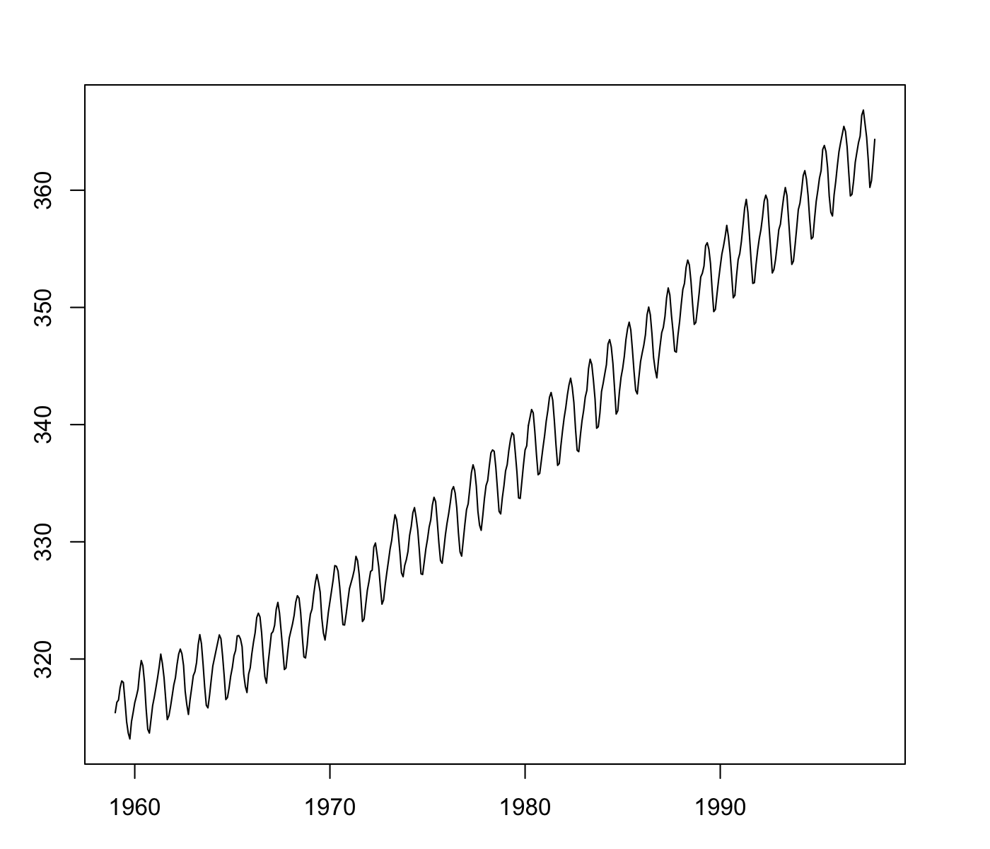
# For comparison, consider a simple time-series plot
plot(co2, type = "l")
Results
Comparing the hodograph with the more conventional time-series plot can be quite informative. Both have strengths, depending on the purpose and the viewer.