Colourizing a trajectory
Introduction
It can be useful to use colour to display z values along an (x,y) trajectory. For example, CTD data might be displayed in this way, with x being distance along track, y being depth, and z being temperature. This post shows how one might do this.
Methods
The R code given below demonstrates this with fake data. The core idea is to
use segments(), here with head() and tail() to chop up the trajectory.
library(oce)
x <- seq(0, 1, length.out=50)
y <- x
z <- seq(0, 1, length.out = length(x))
zlim <- range(z)
npalette <- 10
mar <- par('mar')

palette <- oceColorsJet(npalette)
drawPalette(zlim = zlim, col = palette)
plot(x, y, type = "l")
grid()
segments(head(x, -1), head(y, -1),
  tail(x, -1), tail(y, -1),
  col = palette[findInterval(z,
    seq(zlim[1], zlim[2], length.out = npalette + 1))],
  lwd = 8)
points(x, y, pch = 20, cex=1/3)
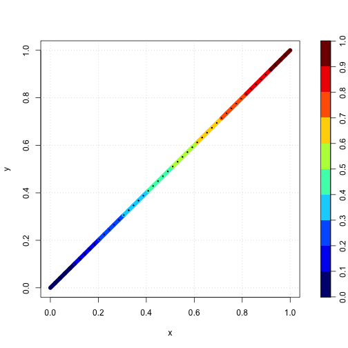
Results
The graph shows that this works reasonably well. The dots will probably not be useful in an actual application, and are used here just to indicate colourization in groups.
Exercises
Find a way to blend colour between the points, perhaps by defining a Euclidian
distance in (x,y) space (which will of course require scaling if x and y have
different units or ranges) and then using approx().